See it work
See how the pieces connect.
Explore one example, then see the real workspace.
Where are you losing clients?
The last steps don't tell the whole story.
A simple funnel: 400 page visits, 20 booked calls and 4 clients.
How to read this example
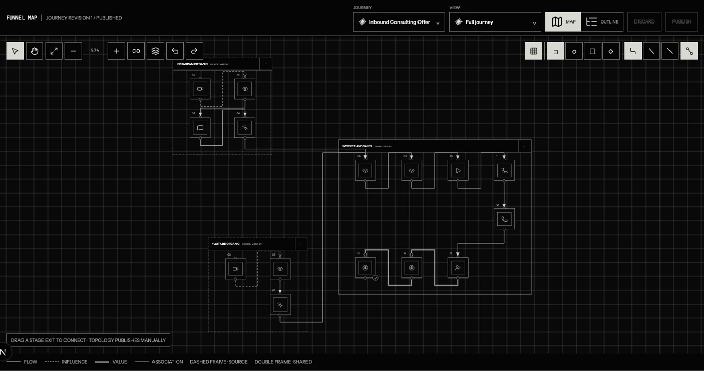
Solid arrows show recorded flow. Dashed arrows show a possible influence. Dotted lines show association, without direction or a causal claim.
One fictional coaching business. The 400 visits, 20 calls and 4 clients describe a July 1–7 booking cohort. Other connections compare separate daily stage totals from April 1–June 23. Routes may overlap; do not add them together.
Lag estimates use the dashboard's correlation analysis. The chart scales each series to compare timing, then shifts one line back by its estimated delay. An association is not proof of cause. Example changes do not modify an account.
The example data
One booking cohort.
| Stage | Recorded total |
|---|---|
| Page visits | 400 |
| Booked calls | 20 |
| Clients | 4 |
The lag charts use earlier daily records from the same example business. Separate stage totals can overlap; they are not additional clients to add together.
The real workspace
Build the map around your business.
Track a change
Give your next change a reason.
Clarify who the booking call is for. Record the change, then compare later booking rates with the earlier records.
Allow for the delay between stages before judging the result.